Projects
My recent work

A client contracted me to lead the product design of their mobile app and we worked closely together through various stages of the design process: from wireframing to an interactive medium-fidelity prototype with user testing throughout.
This project's idea is protected by an NDA; with the client's permission, I chose to replace the original iconography with an icon family that fits the nature of the design and the original copy with placeholder text. Because of that, the original idea and the details of the study herein have been obfuscated. Nevertheless I've tried to communicate the journey as best as possible. Please contact me if you'd like to request permission to view the original prototype.
categoryAbout the project
A client approached me to be the product designer for a new app. It allows its users to build custom recipes and then place orders for products to be made from those recipes. The client would then prepare and deliver the product to the users' homes. Having already done extensive product discovery and market research they had defined the feasibility and audience for the product; they now needed guidance with the user experience. As I'll outline later, this was my opportunity to work on a product which had a design problem that I hadn't previously encountered in other apps.
peopleTeam & role
The team consisted of the client and myself. He was the founder and product manager and I handled user testing and UX design. We had meetings every few weeks in person at Stanford where we tackled UX challenges together, he taught me the details of the app's specific industry and we made plans for app development.
The Problem
The client found that there is a demand for a well-defined system for creating custom recipes for a category of product (I'll refer to it as ProdX) in this particular industry. During market research the client found that there are hundreds of thousands of custom recipes for ProdX and numerous online forums dedicated to discussion of the sometimes nuanced, sometimes extremely varied preparation process. Because of the sheer complexity of the domain, the client believed that it would greatly benefit from an elegant solution through technology. However, that same complexity makes it difficult to navigate proper recipe creation. Right off the bat, problems included:
- Searching for recipes and ingredients
- Creating recipes: selecting ingredients and quantities; adding and configuring steps
- Real time updates to the cooking process after ordering
- Preventing information overload
Audience & User Segments
The client determined that the audience is divided into two main segments: experts and novices in creating ProdX. Each segment needs to use the app to achieve the same result – a finished product based on a recipe they created – but their routes to that result could be quite different.

Novice Creators
- College-aged, 21-29
- •
- Enjoys consuming ProdX but has little to no idea about what goes into recipe creation and product preparation
- •
- Interested in learning more about ProdX and how they can create their own unique recipes

Expert Creators
- Ages 30+
- •
- Very passionate about ProdX: learning and creating recipes for ProdX as a hobby
- •
- Tech savvy; wants to simplify the process of recipe fulfillment
- •
- Interested in a structured system for ProdX
User Flow, Wireframing & Paper Prototyping
While the client already had a list of features and some idea of the hierarchy, we needed a well-defined starting point to organize sections of the app for design and prototyping. This also helped us to look at the app as a whole, figure out what features could be reused for similar components and determine which sections weren't important for the beta release.
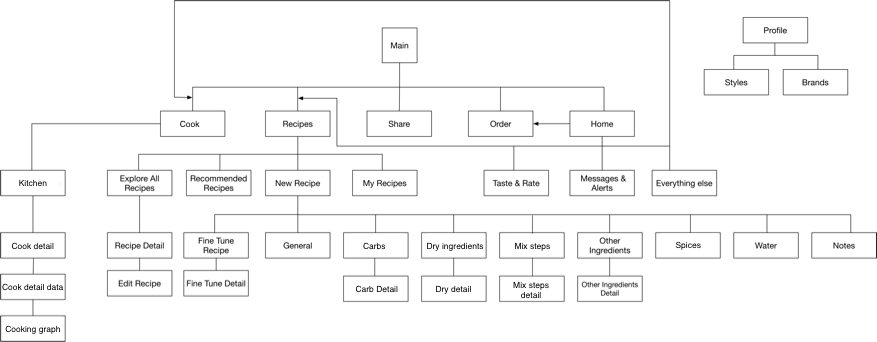
Although there are almost no existing apps for recipe creation of ProdX (and so the competitive analysis was brief), I was able to get guidance from cooking apps and Spotify (search, organization, genres/categories, playlists/collections) for the layout. A few key points I considered while wireframing include:
- Scrollable tips relevant to each section of the app for novice creators to learn as they use the features
- Long lists of ingredients that were fairly easy to maneuver
- Following gestalt principles to organize information in a hierarchy
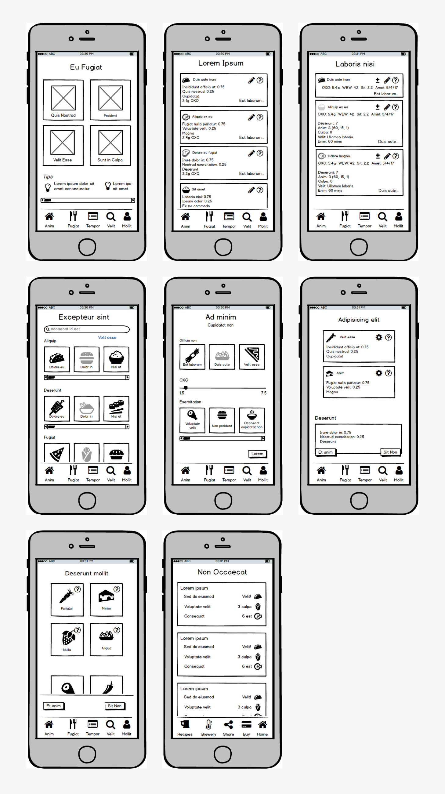
User Research
We used the wireframes above to test with novice creators (college aged, 21-30). The interviews were very useful in examining hypotheses we had about the product/experience and revealing new pathways we hadn't considered but that users deemed crucial to whether they would use the app or not. Here are some of the tasks we asked users to perform:
- Walk me through how you would create a recipe.
- Walk me through how you would select a recipe to tweak.
- Walk me through how you would search for an ingredient.
What we learned
Design insights
Users thought there was too much information on the screen at points and became overwhelmed.
→
Use progressive disclosure design techniques to hide from novice creators information that they don't need but keep it accessible to ease their transition into becoming experts.
Users found that while creating recipes, if there are too many steps and ingredients, it would be difficult to keep track of what's been added so far.
→
Keep a record of what's been done somewhere on the screen that users can reference during recipe creation.
Users were worried that without domain expertise they may ruin a recipe and end up with a bad tasting product.
→
Provide guidance towards creating good tasting recipes through elements such as warnings and suggestions.
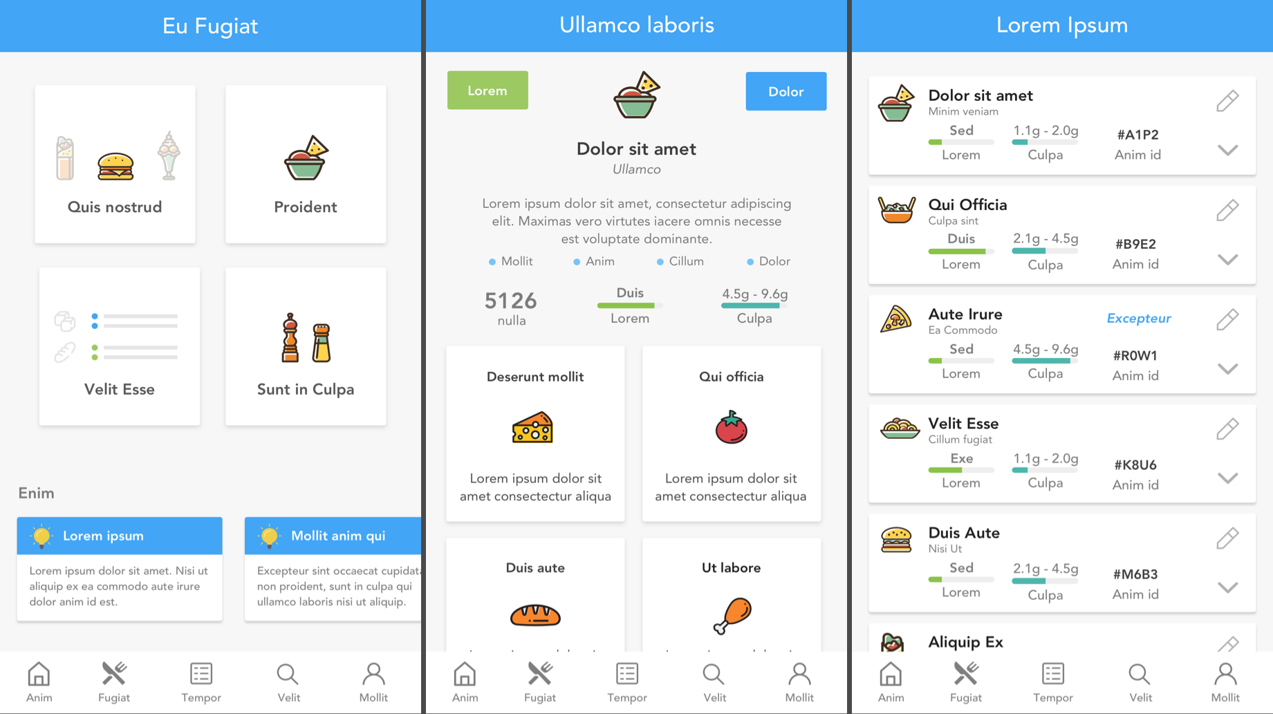
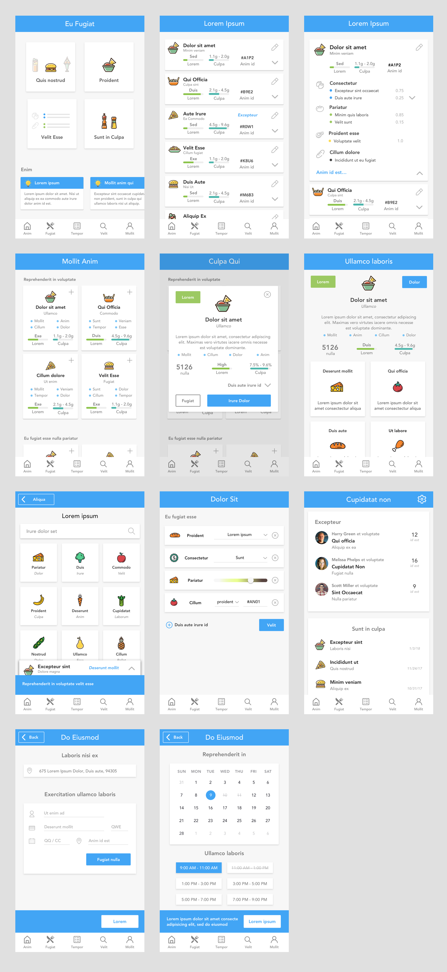
Medium Fidelity Mockups
The app design tries to strike a balance among the various levels of user expertise. A couple of the directions taken are shown here: a list of in-app tips and progressive disclosure (item cards that hide away unnecessary details from a beginner but can be expanded to reveal more complex information to an expert).
The nature of the app's idea meant that users would be presented a lot of information at once. In order to ensure a smooth user experience and moderate information overload we aimed for a consistent icon set, a carefully chosen color scheme, a readable font, a hierarchical layout that observed gestalt principles and smart decisions about white space.
I tried to make sure that different design elements responded to the amount of space available. At the same time, I maintained similar patterns throughout the interface so that various functions would remain identifiable by the user.
UX Challenges
Aside from the challenges we found during our user research, a big problem we tried to solve was giving users a sense of ownership over the recipes they created while maintaining quality in the outcome of the product. In the client's (paraphrased) words "A product that's crafted by your tastes, that still tastes good." While this is still something we're working on, we've made headway by encouraging novices to tweak existing recipes and providing knowledge and guidance while they use the app.
Lessons Learned
While working on Brewtify I improved my visual/UX design skills and my ability to lead a design project on numerous fronts. I also was given an opportunity to solve a design problem that, to my knowledge, had never been tackled directly by existing products.
Here are some of the lessons I learned while working on Brewtify:
Here are some of the lessons I learned while working on Brewtify:
- As with any consulting experience, understanding the domain is key to building a product that's usable. I should have spent more time understanding ProdX and going through the process of real-world recipe creation to build my empathy.
- Although I learned from my experience working on LinkUp and spent time talking with a developer, I should have involved the development team more throughout the process.
- I should have done an additional round of product discovery/validation with the client to tease out more ways to solve the problem.
Interactive Prototype
Because of the NDA this prototype is private. Please contact me to request access.
Other projects